Bathroom Design Basics (Everyone Should Know)…
I get asked a lot what the pitfalls of bathroom design are for designer’s who are just starting out in [...]

In architectural offices I have heard really basic things like “I know how to use colour, I did go to kindergarten”. What people say and what they do however is very different, because what I see in designs all around me is the lack of confidence and knowledge to use colour successfully or in a really satisfying way.
With today’s post I just wanted to give you a few different pallets as a go-to guide, so that you can bookmark this page and come back to it when you are choosing colours for a project and dare to do something a little bit different.
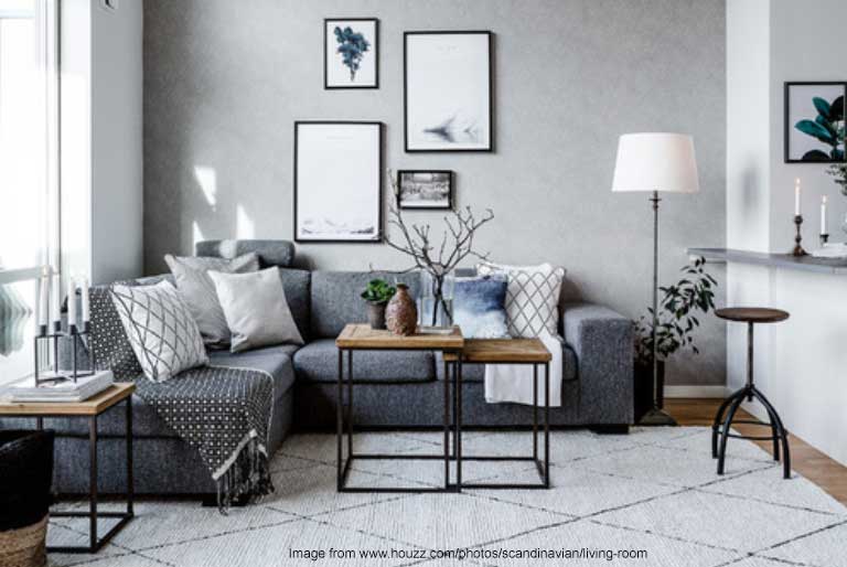
So I will start with a typical Monochrome Interior. Yes, as the name suggests we use only one varying colour. Typically we think of Scandinavian style interiors which are known for confidently using black and white with shades of grey or white on white on white or different shades of timber on white.
Let’s see what you can take away from this when it comes to colour? Whether you are drawn to this type of look or not, there is a good design lesson here! If you are considering decorating and you just want to keep the walls white or predominantly white, (like many homes here in the UK, besides developer magnolia), you can still introduce a colour scheme that is beautiful – even if your home isn’t an architectural gem. What is the end result you are looking for?
Let’s say you are looking for a bright, Scandinavian style, which is predominantly monochrome but want some textural and natural materials. If all the whites are the same – you can use any colour of timber to highlight your space, as long as they are in the same tones. Imagine the white walls as a canvas and backdrop (check the blog image at the top as an example).
I’m only speaking about colour here, one of the reasons why this interior also works is because there is lots of texture in the white elements that creates different shades of white and grey due to the shadows, but that is for another discussion!
Lets now say that you have been living with this style of interior and want a bit of a change and would like to introduce a new element into the design. If we use the same principles of only adding one more colour or tone here is the result:
So here, a blue-grey has been added in different shades and tones. Can you see that it still works? The success here is that large amounts of the grey/blue were added and so again, that is another discussion we can have on the percentages of colour required in a room in order for the colour to look right!
Focus Jo… I know I get a bit too excited about this stuff, so now, let’s say that this is still looking a little too monochrome for you and after living with it for a while you just want some splashes of colour.

Both dark or light tones will work! Both cold and warm tones will work!
Try adding one colour at a time and see how much of it the room can “handle” – this doesn’t vary by rules – it varies by personality. After doing this work for almost 2 decades, I know that there are different personalities and some believe that pastel pink is a bold splash of colour and others believe that a whole room painted in gold and purple stripes is a bold splash of colour. Isn’t this fun?